Juliette's White Horse Feedback
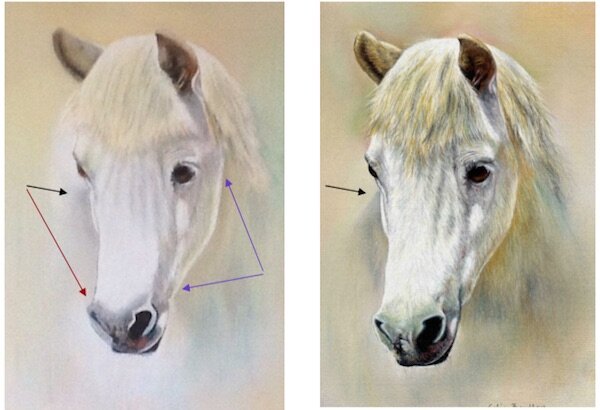
Juliette has sent me her picture of the White Horse project and has asked for any tips I can give her to improve the painting. On the whole Juliette has done well on a difficult subject but has not been quite committed herself to the stronger tones, if you compare Juliette’s picture with the original above you can see what I mean. The body of the horse is indistinct on the left side and can easily be added using the greys and blues, see black arrows. I would also suggest that this tone is brought down to just above the nose area to hide the pencil/print line showing on the left hand side of the head, see red arrow. By adding more strength to the other side of the head this would allow the head to push forward giving the animal a three dimensional effect, see blue arrows.The suggestions I have made would be easy enough to add at this stage as there need be no alteration to the details and the stronger tones would make the world of difference.You can learn to draw this White Horse using Pastel Pencils by signing up for our membership.

