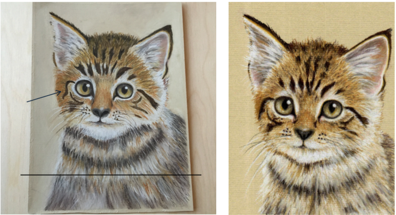
If you can't see what isn't shown on a reference picture, choose not make it up
Ian has sent me his picture of the Kitten project and has asked for my feedback. On the whole Ian has made a good job of this project but there are a few points that are worth mentioning.Ian has extended the kitten’s body too far down the picture and this would have been much better if he had ended it around the black line I have added above.The rule to remember here is "if you can’t see what is not shown on a reference picture don’t make it up". The black marking on the left side needs to be adjusted to line up better with the same marking on the right (see blue arrow). Also the nose is a little too large and is not the right shape.This kitten has been very popular and I am amazed at how well everyone has done, the standard has been very high on this project.If you would like to draw this kitten using pastel pencils click here.

