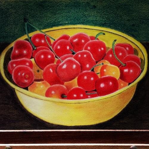
George's Picture Feedback
Here's a fantastic picture of Colin's "Bowl of Cherries" from George. Read Colin's feedback below: Overall this is a very good representation of the bowel of cherries picture but here are a few tips that would make it even better. The dark area inside the yellow bowl on the right ends too abruptly it would have been better to bring some of this shadow onto the other side of the cherries then gradually fade this out. The alternative to that would be to start fading the shadow before you reach the red cherry, either way would work.The depth of background was a little too dark for the brightness of the bowl although it does stand out very well. As it stands I would deepen the shadow on the bowel on the left a little more where it meets the background this will take some of the starkness away.Member's of Colin Bradley Art can not only learn from Colin's tutorials online but also get constructive feedback on their pictures. Click here to become a member.


